Touch Grass: a brutalist open source design system
- Category:
- Product design
- Role:
- Project author (design and implementation)
- Period:
- 2026
For Touch Grass, I started with a visual direction and built components and tokens I could implement and check. The system connects CSS, Tailwind, Figma, and JavaScript/TypeScript, with tests and public documentation.
Source: the repository, published npm packages, and the automated audit run on April 14, 2026. Repository (github.com) Opens in a new tabReact package (npmjs.com) Opens in a new tabToken package (npmjs.com) Opens in a new tab
Challenge
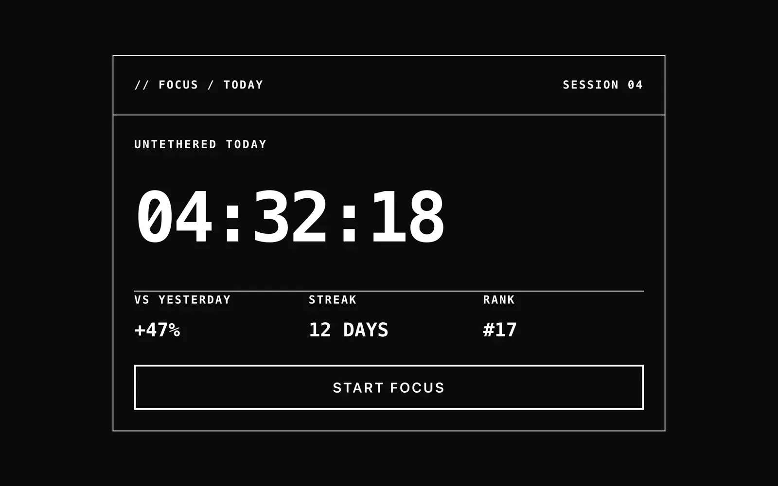
Build a design system with its own visual identity, shared tokens for CSS, Tailwind, Figma and JS/TS, tests and public documentation. The visual direction used square corners, two type families (Geist Sans and Geist Mono) and explicit constraints to guide implementation.
Solution
Design decisions: square corners on every component, two type families, Geist Sans for text and Geist Mono for numbers, labels and data, and a block-character loading state instead of a spinner. Tokens come from a single JSON source, and Style Dictionary generates CSS variables, a Tailwind theme, Figma JSON, and JS/TS constants. Governance lives in code, with a contrast contract test and a custom ESLint plugin. For execution, I used Claude Code with a short spec, a staged plan, tests before components, and review by a separate agent. The decisions above stayed with me.
Results
10 primitives and 9 patterns, 23 test files, and two CI workflows. In the automated axe-core audit on April 14, 2026, the 27 documentation pages had 0 violations and 687 passed checks; the result covers that run, in a local environment. The @touch-grass-ds/react and @touch-grass-ds/tokens packages are published on npm under the MIT license. Limit: this is a personal project, with no consuming teams and no adoption metrics.
Gallery
Crops from the public documentation, captured in October 2026.
Key learnings
What was written in the specification, the agent followed, such as the block-character loading state. What I did not write showed up in review. The reviewer agent noticed the Button did not default to type="button", so a click inside a form submitted it.
Need to turn a product problem into an experience engineering can build?
I can help connect strategy, interface, and engineering in work that stays clear after handoff.